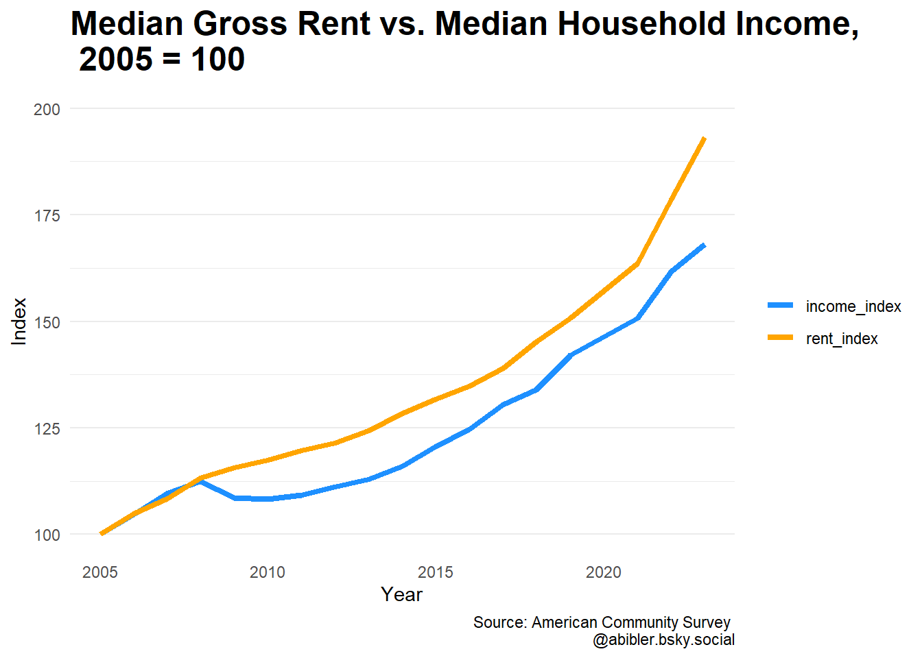
Income vs. Rent Growth, 2005 - 2023
Background
The 1-year ACS data was released last month. Every year, the release is exciting to me since it means the time series of available data gets a little longer. As someone interested in rent affordability I thought I would take a look at the overall change in rents and incomes from the inception of the ACS (2005) to the most recent data year (2023).
This analysis will make use of ‘get_ACS’ function, described in an earlier post.
First, get the median household income and median gross rent tables. Because the 2020 ACS data was not released, I split each in to two separate calls.
us_hh_income <- get_ACS("B19013_001E","us",2005,2019,1)
us_hh_income2 <- get_ACS("B19013_001E","us",2021,2023,1)
us_hh_income <- rbind(us_hh_income, us_hh_income2)

us_rent <- get_ACS("B25064_001E","us",2005,2019,1)
us_rent2 <- get_ACS("B25064_001E","us",2021,2023,1)
us_rent <- rbind(us_rent, us_rent2)
Next, get the starting year values, and covert each time series in to an index.
us_hh_income$B19013_001E[1]
us_hh_income <- us_hh_income %>%
  mutate(income_index = as.numeric(B19013_001E) * 100 / 46242)

rent_start <- us_rent$B25064_001E[1]
us_rent <- us_rent %>%
  mutate(rent_index = as.numeric(B25064_001E) * 100/ 728)
Join the income and rent series together.
rent_income <- inner_join(us_hh_income, us_rent, by = "year")Look at the total difference between the two.
rent_income$Difference <- rent_income$rent_index - rent_income$income_index

total_change <- rent_income %>% select(rent_index, income_index, Difference)
total_change <- total_change[18,]
total_change2 <- total_change %>%
  mutate(across(everything(), function(x) (paste0(round(x, 2),"%"))))

knitr::kable(total_change2)| rent_index | income_index | Difference |
|---|---|---|
| 193.13% | 168.07% | 25.06% |
Cumulatively, rent has grown 25% more than income. But how does this compare over time?
library(ggplot2)

df <- rent_income %>%
  select(year, rent_index, income_index) %>%
  gather(key = "variable", value = "value", -year)


x <- ggplot(df, aes(x = year, y = value)) +
  geom_line(aes(color = variable), size = 1.5) +
  scale_color_manual(values = c("dodgerblue1", "Orange")) +
  labs(caption = "Source: American Community Survey \n @abibler.bsky.social",
     title =
       "Median Gross Rent vs. Median Household Income, \n 2005 = 100") +
  ylab("Index") +
  xlab("Year") +
  theme_minimal() +
  scale_y_continuous(breaks=(seq(100, 200, 25)), limits = c(100, 200)) +
  theme(legend.title = element_blank(),
        panel.grid.major.x = element_blank(),
        panel.grid.minor.x = element_blank(),
        plot.title = element_text(size = 18, face = "bold"))
x
It looks like much of the difference is explained by the great recession, when income fell and rent continued to rise.
Note that this is just at the national level. It would be interesting to look at state differences. Also, this is comparing rent to income, across all types of households (renters and owners). I’ll tackle just renters in a future post.